
Monday 3 June 2013
Project 2: Final revised
For the final revised final, I decided to change rood slap into a roof garden in living areas of the double house. As the building drops level the roof garden provide view of continuous landscape when looking from the office space in the gallery.

Project 2: Final
In the final design, I tried to resolve the program to become tighter and more rational.
That was to get rid of the odd looking balconies and instead focus on making sure each of the rooms actually works. I tried to consider more carefully where and how to position different area of the building in relation with the view and the light; where and how big should each window be. In this final stage, I used the diagonal line connecting end points of the two neighbor to be the line that define the diagonal shape of the building and the courtyard. As a result, the courtyard is completely out from the influence of the two tall building on the two sides, making it having a lot more opportunity for sun and light access.
I also think about the materials I think the building should have. Brick and wood for living area, ceramic tiles and glass for galleries. I also want to express the functions of the building in its street elevation: domestic and public. The result is that the building has a street elevation combined from wood, glass and ceramic tile. As the a mount of material shifting from wood to ceramic and glass from left to right, the functions of the building behind this facade is also shifted: from the more domestic part to the more public part.
 Site and elevation
 Level -2 and -1
 Level 0 and 1
 Sections
Perspective drawings.


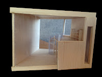
Physical models


Project 2: Double House/Garden: Sketch design 2
In this the goal of design, the desire to keep the building in contact with Rowen Place and the idea of the courtyard between the two houses are maintained.
In order to solve the problem about the high neighbors and sunlight. I decided to push the building far back to the site as much as possible so that the courtyard and main facade of the two house can get away from the shadow of the neighbors. This resulted in making the building line diagonal. The gallery spaces are to completely separate from living areas. Another courtyard sit in between gallery spaces and living spaces of the art collector.
Because of the desire to increase interaction between the two occupants, I designed for the living room, kitchen, laundry of the two house at the same level. In the art collector house, these are located at lower lever so that sleeping area on the upper one with the modern view of the city. In the father house, these are locate at upper level. The most private parts (study and sleeping area) are at the lower with the view of the ancient looking Rowen Place. This arrangement is based on my thought about the different in generation between the occupants. The old and the young. The new and the ancient. The quiet and the robust. The modern and the preserve.
 Level -2
 Level -1
 Level 0
 Level 1
Project 2 Double House/Garden: Initial design.
The double house is for an art collector and her father. The requirement that the double house also has to have a public area which serves as Gallery. The design goal is to create an living space that can provide a living space that can encourage the communication between the two occupants, a public space that celebrates the present of art works but at the same time doesn't violate the privacy aspect of the house. I also found two opposite aspects of the site that were interesting. The wide city view when looking straight west and the view of an massive, ruinous looking brick arches when looking down low at Rowen Place. It is the desire to keep provide as much contact with this more quite view that I decide to drop the building levels.
 Therefore, in the initial design, I made two houses separate by a small courtyard. The bigger one for the art collector incorporate gallery space for the public. the smaller one at the back of the site, dropped down two level is for the father.
The problem with this scheme is in the circulation and program planning. Another issue is as the site is sandwiched between two high building, the courtyard, designed as it was then would always in shading and virtually never get any sunlight.
 Level -2
 Level -1
 Level 0
 Long Section
 Physical model
Tuesday 16 April 2013
Project1 - Bordeaux Maison: Interior and Exterior
For the part about interior and exterior, I tried to look at the impart of the interior and exterior to each other. Beginning with locating, on each floor, where the exchange, impact between in-out happen and the degree of these exchanges. Where there is no boundary or clear glass separating interior and exterior, the impact is strongest. Where there is translucent glass, the exchange still can be possible but where there is steel door of panel between, the exchange between inside and outside is severed.

 By set out these agreements and mapped them on the plans of each floor, I got the result of the relationship inside and outside and how this relationship in relate to the used pattern. The second public level with its clear glass wrap and no boundaries in some parts seem to dissolve into the exterior. The outside flows in and the inside extended out infinitely.


 The top private space with its enclosed box and tiny opening may seem to be the most restricted but when looking at the mapped plan based on the agreement, the outside has quite a lot of impact on it. Each small openings like camera lens that capture the unique view of the outside without compromise the private value. The inside is also influenced by outside through skyline roof over ratio, elevator, glass balcony. Unlike that of the middle level, the relationship here is one-sided: the outside seem to leak in but the inside seems quite closed off to the outside.


 The bottom semi-public floor, as it turned out, is the most restricted space in term of the relationship with outside. When related this back to the program, I noticed that the main activities of the occupants happen in the upper two levels, these levels have more exchanges with the outside, though eventhe nature of these exchanges are different depending on the nature of the main activities happening on each floor. Activities on the bottom floor (cooking, watching tv, guest coming,...) are minor and often brief, so the relationship here is somehow only for circulation purposes.


 By set out these agreements and mapped them on the plans of each floor, I got the result of the relationship inside and outside and how this relationship in relate to the used pattern. The second public level with its clear glass wrap and no boundaries in some parts seem to dissolve into the exterior. The outside flows in and the inside extended out infinitely.

 The top private space with its enclosed box and tiny opening may seem to be the most restricted but when looking at the mapped plan based on the agreement, the outside has quite a lot of impact on it. Each small openings like camera lens that capture the unique view of the outside without compromise the private value. The inside is also influenced by outside through skyline roof over ratio, elevator, glass balcony. Unlike that of the middle level, the relationship here is one-sided: the outside seem to leak in but the inside seems quite closed off to the outside.

 The bottom semi-public floor, as it turned out, is the most restricted space in term of the relationship with outside. When related this back to the program, I noticed that the main activities of the occupants happen in the upper two levels, these levels have more exchanges with the outside, though eventhe nature of these exchanges are different depending on the nature of the main activities happening on each floor. Activities on the bottom floor (cooking, watching tv, guest coming,...) are minor and often brief, so the relationship here is somehow only for circulation purposes.
To represent every point I took notice in this investigation, I took of a person standing inside the house and look around to the outside view. I arrange these view side by side from west-north-est-south and on top of each other from top to bottom floor. What I ended up with was kind of like a elevation from the inside with the distinct view of each floor: bottom - one and limit; middle - wide and continuous; top - unique and various.

Project 1 Bordeaux Maison part b: Private and Public
To investigate privacy and publicity of the house, I mapped the pattern uses of each type of occupants like kids, the wife, the man, guest with color then laid them on top of each other. I got the result of mapped area showing different degrees of color patches. The darker the patches, the more public those space are as it mean more occupants using those spaces. The interesting about it is, like the degrees of gradient, I got a range of different degrees of privacy and publicity in the house. I can see, even in the space considered as private space as the top floor, there are spaces within that are more public.
Having mapped the uses of each occupants, I got the percent of uses and sum them together and then compare to the total used space. What I noticed is there is some certain formula for public space and private space. Between the four types of occupant, in the top private level, the sum of used spaces is nearly the same as the total space but in the middle public floor the sum of used spaces is nearly four times more than the total space.

Having mapped the uses of each occupants, I got the percent of uses and sum them together and then compare to the total used space. What I noticed is there is some certain formula for public space and private space. Between the four types of occupant, in the top private level, the sum of used spaces is nearly the same as the total space but in the middle public floor the sum of used spaces is nearly four times more than the total space.

Project 1: Bordeaux Maison part a
For part a, I chose the part cut through the elevator and looking toward the bookshelves.


The reasons I chose this part for presenting the whole house is that it showcases some of the main aspects of the house. It shows the elevator-"the heart" of the house with its massive translucent bookshelves. This space through 3 levels is the main domain of the man in wheelchair, for whom the house is made for. This part shows part of the unconventional structure: the L-shape structure leaning on the I column on one end supports the heavy box on top. The part includes two separate circulations: the elevator for the man and the staircase for his wife. This present the circulation strategy of the house, in which every type of occupants has their own circulation path.


Subscribe to:
Posts (Atom)